Summary
| 1 | Introduction |
| 2 | Editor interface |
| 2.1 | Scene editing area |
| 2.2 | Application file buttons |
| 2.2.1 | Application Name |
| 2.3 | Scene control buttons |
| 2.4 | Screen aspect ratio buttons |
| 2.5 | Element buttons |
| 2.5.1 | Scene Configuration |
| 2.5.2 | Add Text |
| 2.5.3 | Add Image |
| 2.5.4 | Add Video |
| 2.5.5 | Add Interaction Area |
| 2.5.6 | Configure Feedback |
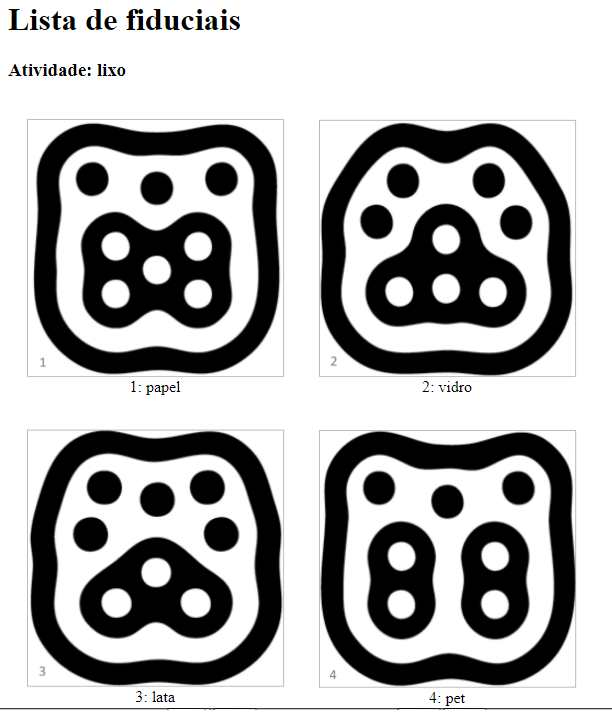
| 2.5.7 | List of Fiducials |
| 2.5.8 | Configure Requirements |
| 3 | Emulator |
| 4 | Guide for creating applications |
| 5 | Image Animation |
Eduba is an Editor of Tangible and Electronic Educational Resources that allows the creation of activities for a tangible tabletop. The editor is part of Nidaba Project, developed on the Post-Graduation Program “Computing for Educational Purposes” (PPGIE), in the Federal University of Rio Grande do Sul (UFRGS). The project was given its name in reference to the schools dedicated to Nidaba, the Sumerian goddess of writing, learning and astrology, acting as instructor and guardian of knowledge for both men and gods. The Sumerians invented writing between 3500-3000 BC as a way of communicating for trading. The cuneiform writing used clay impressions and its oldest known form were pictographs – symbols that represented objects and concepts. The schools dedicated to Nidaba were called E-DUB-A, and this way, Nidaba became the deity of literacy and patron of the art of writing. Our Nidaba system intends to, by assuming this name, recover the pictographic power in the representation of knowledge and of tangible objects, the same way clay tablets acted as support in the past. All these elements will be presented in this tabletop, now renewed and diversified with pictograms, sounds, animations and tangible objects.
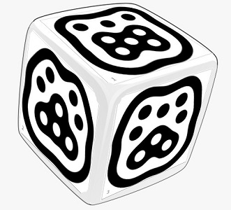
The Editor is based in a web interface and the activities are formed by a set of scenes. In each scene, a series of elements is selected: a background image, a narration audio or explanation and all the other images that compose the scenario, these having the possibility of either being animated or not. When there’s interaction with tangible objects, its areas are delimited and the configuration of the correct and incorrect fiducial markers (img. 1) are displayed, thus, there’s a respective auditive or visual feedback for each answer. These fiducial markers are fixated in the base of real objects that interact with the tangible tabletop.
Image 1 – Fiducial Markers fixated n the base of real objects

On Eduba Editor’s starting screen (img. 2) it is possible to choose its language (Portuguese, English or Spanish), Create New Application or Load Existing Application.
Image 2 – Eduba’s starting screen

By creating a new application, it is requested that you inform its name and we recommend that you don’t use special characters such as blank spaces, cedilla, or punctuation marks, because otherwise the file could present problems if starting in another computer. In case these characters are used, the system will automatically replace them for hyphens.
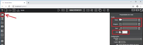
After creating or loading an application, the editor interface (img. 3) presents to the center, the scene being edited.
On the top bar of the interface, the buttons are related to the application file, to the scene control and to the screen proportion.
On the left bar, you can find the tools used to compose a scene.
On the right bar, you can find the properties of the element that is selected.
Image 3 – Eduba’s editor interface

Scene elements must be inserted in the central area of the editor. They can be selected in the element button bar, which is to the left of the editor. When selecting an element in the bar, you must click on the scene's editing area and define its position. You can do so by dragging it, defining its size, resizing it with the mouse, either from its edges or by defining its properties on the right part of the interface.
Clicking on the Eduba Editor icon  , in the upper left corner, the system help will be displayed, with the software usage manual.
On the left part of the top bar, there are the buttons related to the application file:
 New Application: exits the application being edited and creates a new one.
 Load Application: exits the application being edited and allows you to open another one for editing.
 Save Application: saves the current application. The system automatically saves a backup file every 10 minutes. Should any problems occur, the system will notify you that there is an automatically saved copy and will give you the option to either load it or not.
 Close Application: exits the current application and returns to the editor's home menu.
 Download Application: downloads the application either for backup purposes or to take the application to another computer.
 Delete Application: deletes the current application along with all audio, image and video files and returns to the editor's home menu. For security purposes, this button is located in the far bottom left corner of the editor, away from other buttons.
The application name appears next to the application file buttons.
By clicking on the application name, a link for viewing it in the emulator appears. This link can be sent to people who do not have access to Eduba Editor.
This link only allows people to view the application, it does not grant editor permissions.

In the center top bar are the scene control buttons. An application is a set of scenes, which are displayed according to the desired order:
 Show scene: presents the current application, through the emulator.
 First scene: displays the first scene.
 Previous scene: displays the previous scene.
 Scene selection box: allows you to go straight to a specific scene.
 Next scene: displays the next scene.
 Last scene: displays the last scene
 Order scenes: allows to change the scenes order and their names in the properties box to the right of the editor. To change their name, click on the box “Scene name” and type in the desired new name. To change the order, select a scene and then click on the arrows to move it to the end or the beginning of the list.
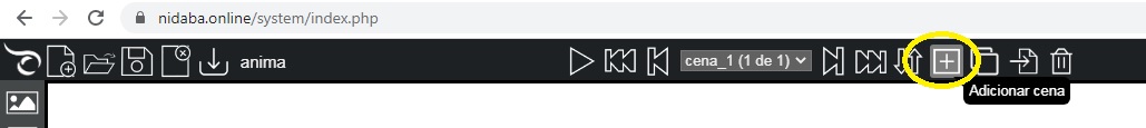
 Add Scene: adds a new scene in the end.
 Duplicate Scene: makes a copy of the current scene, inserting it in the end.
 Import Application: imports an application, copying all of its scenes to the current.
 Delete Current Scene: deletes the current scene.

2.4 Screen aspect ratio buttons
In the upper right part of the screen are the screen proportion buttons, so that it is in accordance with both the tangible tabletop and projector proportions. The first application detail that should be edited is the resolution, in case the proportion is important and you wish to avoid distortions. This is important especially if you intend to insert circles or images of people:
 4:3: formats the application so that it maintains a 4:3 aspect ratio (800x600, 1024x768).
 16:9: formats the application so that it maintains a 16:9 aspect ratio (1366x768, 1280x720 HD, 1920x1080 Full HD).
 Fullscreen: puts the application into full screen, according to the resolution of the editor’s computer, hiding and unhiding the object properties bar.
In each scene, the elements that make up the scenes can be defined and inserted from the element bar, on the left of the screen. When selecting an element, its properties are displayed in the area to the right of the screen.
The Configure Scene button
 allows you to define the scene properties:
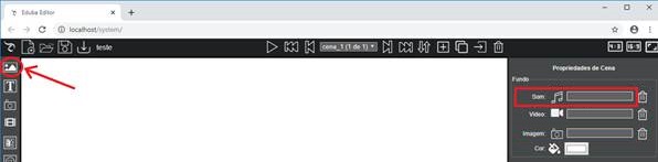
- Background audio: allows (optionally) to choose an audio that will be played with the scene activity.
- Background video: allows (optionally) to choose a background video for the scene
- Background image: allows (optionally) to choose a background image for the scene. The image must be in JPG, PNG or GIF formats.
- Background color: allows (optionally) to choose a background color for the scene.
- Next scene: allows (optionally) to define what will be the next scene displayed and the waiting time (Go after) before it switches to the next scene.
After all the fiducials have been correctly placed in their respective areas or the animation has been executed, the application will automatically skip to the defined "Next scene".
If a next scene is defined in the Fiducial Area, it overlaps the current one, otherwise this will follow the application sequence. This is normally used for linear applications.
If the chosen option is "-- None --" and there is no definition of next scene in the interaction areas, the application will continue showing the current scene
If the chosen option is "↶ Back --", the scene that had been displayed before going to the current one will be displayed again. This is an useful tool for displaying tips, which can be made in different scenes.
If the chosen option is " ↺ Restart --", the first scene of the application will be displayed and the requirements will also start all over. - Require removal of objects from the tabletop: when this option is checked, the objects movement and fiducial markers on the tabletop will not be processed in the next scene, avoiding undesired processes and treatments. If you wish to use the objects in the remaining scenes, it is necessary to remove them from the tabletop and place them all over again.
- Show area contours in the player: with this option checked, the outline of the interaction areas is displayed in the player, making it easier to identify the interaction locations. If this option is checked, you can choose the outline color.

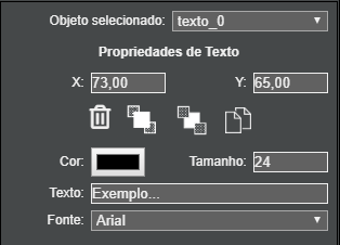
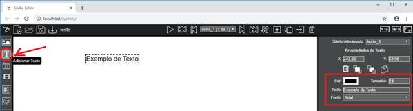
The Add Text button  allows you to add text to the scene and define X, Y position, color, size, text and font. It allows you to change the order of placement in the scene: bring it forward, send it back, copy and delete the object.
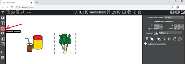
The Add Image button  (Element Buttons) allows you to add an image to the scene. It is recommended to use images in .PNG or .GIF format (it accepts animated GIFs) with a transparent background, if the background of the scene is not entirely white.
You can drag and resize the image or manually enter the values of the X and Y coordinates and the Width and Height in the image properties. If you manually change the width, the height will be automatically adjusted to maintain the aspect ratio. If you change the height, the aspect ratio will not be maintained.
The image can be changed by clicking on the (Image: ) Change Image button in the Image Properties.
There are buttons that allow you to delete the image element from the scene, change the placement order in the scene: bring it forward and send it back, horizontally or vertically mirror, rotate 45º and copy the element to be pasted in the same scene or in another scene. If it is in the same scene, it will be pasted in the position where you clicked. If it is in another scene, it will be pasted in exactly the same original position, regardless of where it was clicked.

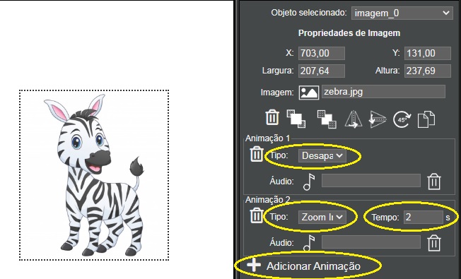
- Add animation: Optionally allows you to add animations to each image. Several animations can be added to the same image. Some examples are:
- Delay: causes the image to appear after a defined time.
- Disappear: hides the image, so that it disappears after some time or at the beginning of another animation, such as before the "Appear", "Zoom in" or "Fade In" effects
- Fade out: causes the image to be hidden with its transparency varying according to the defined time.
- Zoom out: causes the image to be hidden, with its size decreasing until it disappears, according to the defined time.
- Appear: causes the image to be displayed. It is usually used after an animation that has previously hidden the image, such as the "Disappear" effect.
- Fade in: causes the image to be displayed with its transparency varying according to the defined time. It is usually used after an animation that has previously hidden the image, such as the "Disappear" effect.
- Zoom in: causes the image to be displayed with its size increasing from 0 up to the normal size, according to the defined time. It is usually used after an animation that has previously hidden the image, such as the "Disappear" effect.
- Slide: makes the image disappear, sliding up, down, left or right, according to the defined time.
- Highlight: highlights the image, with the chosen color during the defined time.
- Shake: shakes the image for the set time.
- Pulsate: quickly displays and hides the image during the set time.
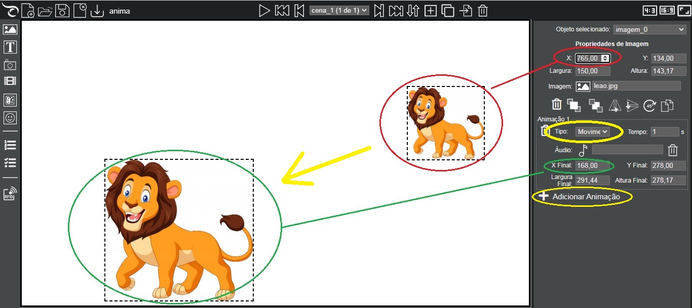
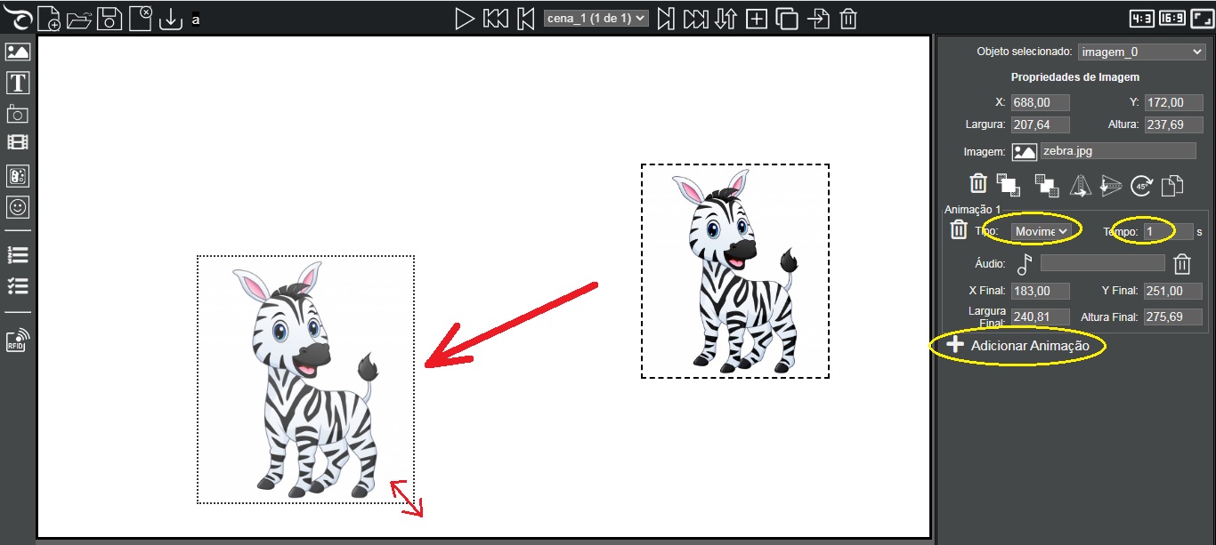
- Movement: moves the image to a new position (final X and Y) and size (final Width and Height) informed, according to the defined Time (duration in seconds of the animation). To define the final position and size, after adding a motion animation, simply drag the image to the desired position and adjust its size, resizing by dragging its borders or explicitly entering the values.
After including an animation movement, clicking on the “X” image property allows to change the initial position and size; clicking on the “Final X” property can change the final size and position of the image.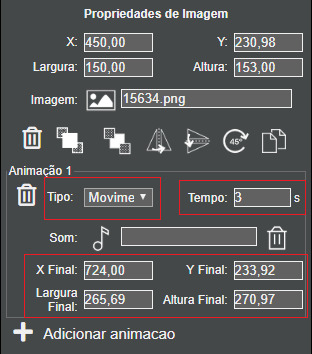
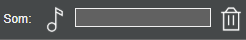
For each animation, an audio can be chosen through the audio choice button, which will be played during the animation. To exclude audio from the animation, click on the trashcan icon to the right of the audio choice box.
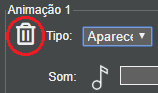
To delete an animation, click on the trashcan icon on the left side of the animation type selection box.
Chapter 5 “Image Animations” provides more details on using image animations.
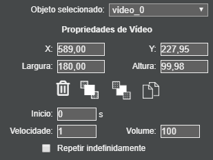
The Add Video button  allows you to add a video to the scene, defining its start time, play speed, volume (0 to 100) and whether it will run once or if it will be repeated indefinitely. Allows you to change the placement order in the scene: bring it forward or send it back, copy or delete the object.
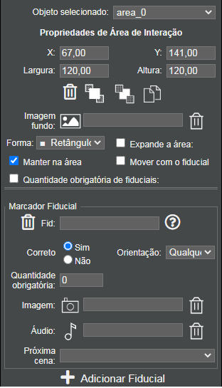
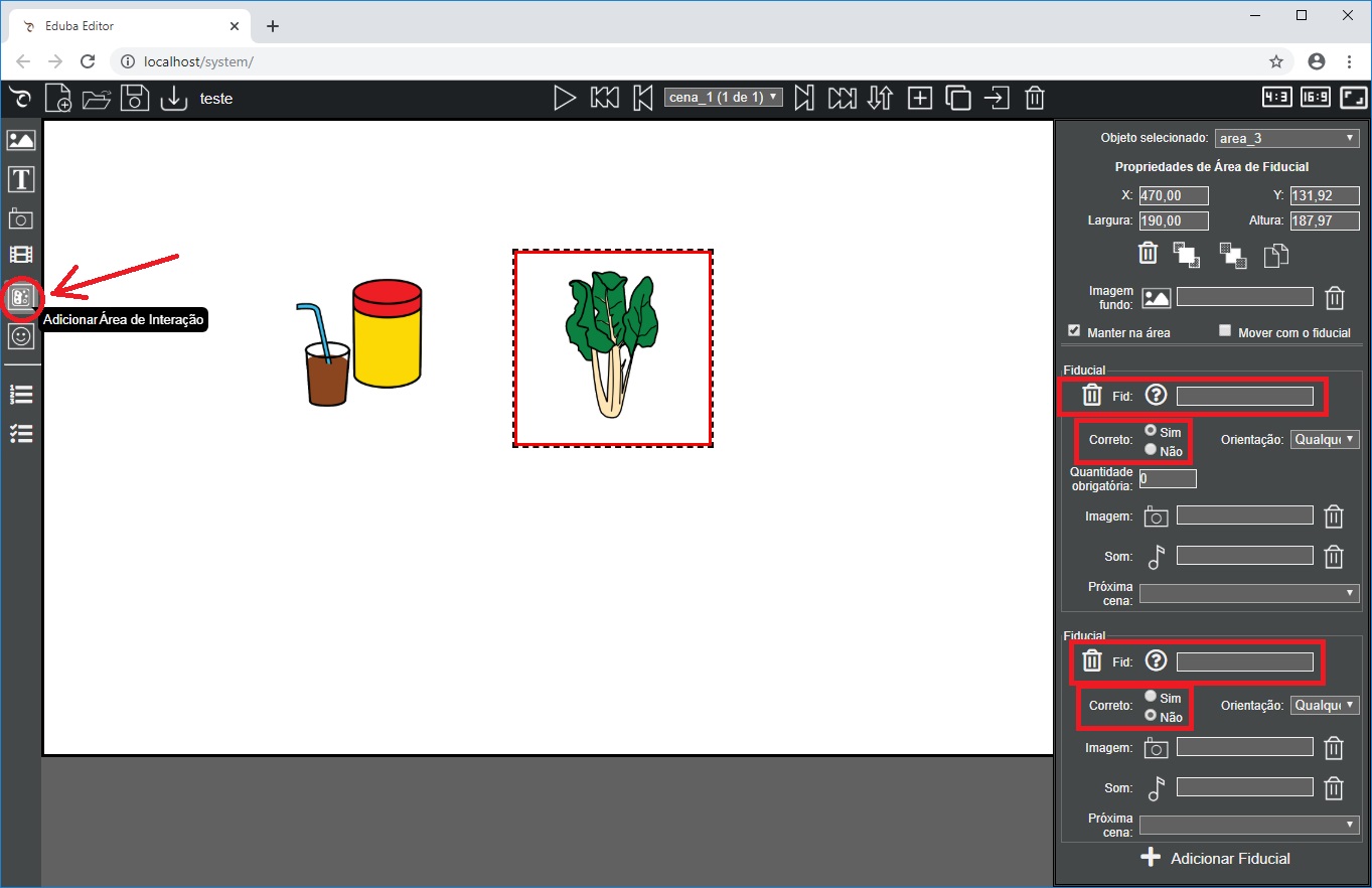
The Add Interaction Area button  adds an interaction area through the fiducial markers in the application.
The principle of interaction on a tangible tabletop is based on placing real objects with fiducial markers (identified with numbers from 1 to 40) on specific areas of interaction on the surface of the tangible tabletop.
This interaction defines the positions and coordinates of these areas, which are the correct and incorrect fiducial marking elements and the respective sounds that will be played and the respective images that will be displayed.
After adding and positioning the interaction area in the appropriate place, it is necessary to define::
- Background image of the area: allows you to choose (optionally) a background image for the area. This image will always be displayed in the interaction zone, but can be changed after fiducials are placed.
- Shape: allows you to choose the geometric shape of the interaction area. It is normal for the interaction area to be square or rectangular, but it can be changed into:
- ■ Rectangle/Square
 Octagon
- ♦ Rhombus
- ● Ellipse/Circle
- ▲ Triangle
- ► Triangle
- ▼ Triangle
- ◄ Triangle
- ◥ Triangle
- ◢ Triangle
- ◣ Triangle
- ◤ Triangle
- Expands the area: fmakes the area act as if it were another. When using this option, you should choose which area the operation will be applied to.

This allows you to expand an area to cover other parts of the scene, as if it were an extension of the original one. Since the interaction area is square, it is not always possible to cover all the desired parts with a single area. With this option checked, you can add several other areas in the scene and they will act as if they were the same, but each one respecting its delimited areas.
You can only expand an interaction area that has been placed on the scene before the area being edited (area_xx must be less than the identification number of the area being edited).
With this option checked, no fiducial marker settings can be added, since the area acts along with the settings of the chosen area.
This is useful, for example, to put the correct color on a flower that has a yellow center and 6 red petals. Since the red petals are around a yellow area, it is not possible to just add two simple areas given different areas are required for the petals:- area_1 (over the center of the flower): Expands the area: not marked; Fiducial 1 (yellow) - Correct: yes - mandatory quantity: 1; Fiducial * - Correct: no
- area_2 (on one of the petals): Expands the area: not marked; Fiducial 2 (red) - Correct: yes - mandatory quantity: 1; Fiducial * - Correct: no
- area_3 (over another petal): Expands the area: marked; area: area_2
- area_4 (over another petal): Expands the area: marked; area: area_2
- area_5 (sover another petal): Expands the area: marked; area: area_2
- area_6 (over another petal): Expands the area: marked; area: area_2
- area_7 (over another petal): Expands the area: marked; area: area_2

This feature can be combined with the areas of interaction in the shapes of circles, rhombuses and triangles, to cover an irregular area such as a map, for example, in which the areas are distributed the following way:- Area 1: Fid: 1 - Correct: yes - Quantity: 1; Incorrect: *
- Area 2: Fid: 2 - Correct: yes - Quantity: 1; Incorrect: *
- Area 3: Fid: 3 - Correct: yes - Quantity: 1; Incorrect: *
- Area 4: Expand area: area 1
- Area 5: Expand area: area 1
- Area 6: Expand area: area 1
- Area 7: Expand area: area 2
- Area 8: Expand area: area 2
- Area 9: Expand area: area 3

*Note that when an area expands another area, these areas can overlap, without problems, given that they are treated as if they were one.
The areas that are distinct should not overlap, as the placement of the fiducial will be dealt with in both areas in a different way.
- Keep in the area: : if this option is selected, it will require that the objects with the correct fiducials are positioned over the area to complete the task. If the option is not selected, it will be enough that the correct object is dragged over the respective area once to be considered as a correct insertion, which can be removed or moved over the tabletop.
If an object is moved randomly over all areas and the "Keep in area" option is not selected, when it crosses over the correct area it will count as a correct insertion. If the "Keep in area" option is selected, it will only be considered correct if the object remains on the supposed area. - Move with the fiducial: allows the fiducial area, with a background image, to move with the fiducial, allowing dragging movements to another area. If this is selected, a choice option will pop up to move to the correct destination area.
This option is used to implement waste collection activities, for example, where an area can have an image of broken glass which can only be moved by the fiducial of a shovel to the appropriate bin for glass. Only the correct fiducial moves the area to the correct destination. If it is dragged to an incorrect destination, it returns to the its starting position . - Mandatory fiducial quantity: if this field is checked you must define how many correct fiducials are required for the area to be complete, when more than one list of correct fiduciaries is used.
This setting overrides the mandatory quantity defined in the fiducial lists. If this option is checked, the Mandatory Quantity of the correct fiduciary lists is hidden and disregarded. If this option is unchecked, the mandatory quantity is defined in the correct fiducial markers setting tool.
This option is normally used when custom audio and images are desired for each fiducial, but it is not required that all be placed in the area .
For the interaction to occur, it is necessary to define one or more correct or incorrect fiducial markers for the area:
- Fiducial (Fid): defines the correct or incorrect fiducial marker identifiers for the area of interaction. You can use the identifiers from 1 to 40. In case the list of fiducials was previously defined, by placing the cursor over the (?) Button, the list of fiducials in use in the application will be displayed, with the respective identification.
- To define a single fiducial, simply enter its number.
Fid: 1 - To define a list of fiducials, just type the fiducial numbers separated by either a blank space and a comma or only blank spaces.
Fid: 1, 2, 3 ou Fid: 1 2 3 - To specify "Fiducials that are not in the previous lists"", just leave it blank or type an asterisk *
Fid: *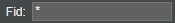
To avoid errors, the system does not allow you to enter numbers if an asterisk has already been entered, or to enter the asterisk if numbers have already been entered. If you wish to change it, it is necessary to firstly delete what was already typed. - To define a single fiducial, simply enter its number.
- Correct: defines whether the fiducial or the list of fiducials filled in the previous field is correct (Yes) or No.
- Orientation: defines whether the orientation (rotation) of the fiducial on the table is necessary or not. The default is "Any orientation", that is, all that needs to be done is placing the object on the tabletop.
In some activities it is necessary to define the orientation, for example, the number 6 must be placed with the correct orientation so as not to be confused with the number 9; the major or minor signs (< or >), could be a single fiducial with the orientation set to 0º (↑) for the minor sign (<) or with the orientation set to 180º (↓) for the major sign (>).
The angles for defining the orientation are: - 0º - ↑
- 45º - ↗
- 90º - →
- 135º - ↘
- 180º - ↓
- 225º - ↙
- 270º - ←
- 315º - ↖
- Mandatory Quantity: if the list of correct fiducials has more than one fiducial, this field defines how many of them are required to carry out the activity. For example, if fiducials 1, 2, 3 are defined as correct and the mandatory quantity is set to 1, just place any of the fiducials 1, 2, or 3 in this area for the activity to be completed; if a mandatory quantity is defined as 3, fiducials 1, 2 and 3 must be placed in the area for it to be completed. A mandatory quantity greater than the number of fiducials can also be defined, for example, if fiducial 1 is defined for an area and mandatory quantity 3, it means that 3 objects with fiducial 1 must be placed in this area.
- Image:allows you to choose (optionally) an image to be displayed in the area, when the fiducial is placed in there. If there was a background image of the area, it will be replaced by this one.
- Audio: allows you to choose (optionally) an audio that will be played when the fiducial is placed in a specific area. This makes it possible to customize the feedback, according to each object/fiducial.
- Next scene: : allows you to define (optionally) the next scene that will be displayed when the fiducial is placed in a certain area.
This is useful for making non-linear applications and menus, going to specific scenes according to the chosen object. This option overrides the "Next Scene" setting in the Scene Setup/ Properties.
The next scene is shown for both the correct (correct: yes) and the incorrect (correct: no) fiducials, for creating menus and also to display additional tips and lessons in case of errors.
If the chosen option is "↶ Back --" the scene that had been displayed before the current one will be displayed. This choice is useful for displaying tips and reinforcement lessons, which can be made in different scenes.
If the chosen option is " ↺ Restart --" sthe first scene of the application will be displayed and the requirements will also be restarted. - Add Fiducial: allows you to add a new list of fiducial markers, with all their respective properties.
You can add multiple fiducial lists. Usually, an area has at least one correct trust and an asterisk (* - all others that are not correct) for incorrect fiducials, but several lists can be defined with correct and incorrect trust.
The execution of the application executes and gives feedback to the first list that satisfies the correct condition.
If two or more incorrect lists have the same parameters, the first time executes the first list, the second time the second list, the third time the third list, and so on until the number of lists is completely executed, always repeating the latter, when it exceeds the number of lists. This is useful to allow different error feedbacks, such as changing the explanation as the errors are repeated, and even being able to skip to a scene (by defining the "Next scene") with more detailed explanation, tips and lessons
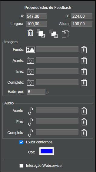
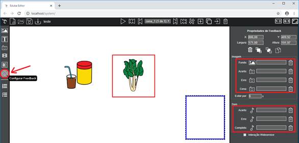
The Configure Feedback button  allows you to configure (optionally) a generic feedback audio and image for all successes and errors in the interaction areas of the scene, according to the fiducial placed in the area.
If the audio is the same for all fiducials, instead of configuring it in each area of interaction and each list of fiducials, it allows defining the following topics in the feedback:
- Background image: allows you to choose an image that will be displayed in the feedback area while there is no interaction with the fiducials.
- Success image: permite escolher uma imagem que será exibida durante alguns segundos na área de feedback quando for colocado um fiducial correto numa área da cena.
- You failed image: allows you to choose an image that will be displayed for a few seconds in the feedback area when an incorrect fiducial is placed in an area of the scene.
- Complete Image: allows you to choose an image that will be displayed for a few seconds in the feedback area when all the correct fiducials have been placed in the respective areas of the scene and the activity of the scene is competed.
- Display by: allows you to set the display time for the feedback images. The default value is 6 seconds.
- Success audio: allows you to choose an audio that will be played when a correct fiducial is placed in its respective area.
- You failed audio: allows you to choose an audio that will be played when an incorrect fiducial is placed in an area of the scene.
- Scene Completion Audio: allows you to choose an audio that will be played when all the correct fiducials have been placed in the respective areas of the scene and the activity of the scene is competed.
- Show contours: allows you to choose whether the contours of the feedback area will be displayed or not. If the option is to display outlines, the border color can be chosen.
- Interaction Webservice: is used for interaction with other applications, such as electronic puppets, robots and virtual reality. In this case, in the feedback the identifier and the value must be defined and the programming of the interaction must be carried out in the webservice.php file.
The Fiducial List button  allows you to register meaningful names for trustees to facilitate filling in fiducial lists.
All fiducials that are used in the application will be automatically included in this list. The trustee's identification number is in the text box on the left and the name of the trustee is in the right text box. Optionally, the name of the fiducial marker can be changed to make it more meaningful.
allows you to register meaningful names for trustees to facilitate filling in fiducial lists.
All fiducials that are used in the application will be automatically included in this list. The trustee's identification number is in the text box on the left and the name of the trustee is in the right text box. Optionally, the name of the fiducial marker can be changed to make it more meaningful.
- Image: allows you to choose a significant image for the fiducial to be displayed in the emulator, when testing the application.
- Allow only fiducials from this list: if this option is checked, only the fiducials from this list will be interpreted by the tangible tabletop, avoiding errors in reading the fiducial markers and elements that are not part of the application.
- Add Fiducial: allows you to add fiducials that have not yet been used in the application with other identifiers or to include other fiducials with the same identifiers already in use (to test the application when the required quantity of a fiducial is greater than 1).
- Display a dice in the emulator: if this option is checked, a fiducial that represents a dice will be displayed in the emulator.
When clicking on the dice then on the scene, a random number between 1 and 6 is chosen. When placing the dice on an interaction area, the action corresponding to the number drawn (fiducial from 1 to 6) will be performed. - Print list of fiducials: print the list of fiducials of the application with their respective names, to be pasted on the base of the real objects.
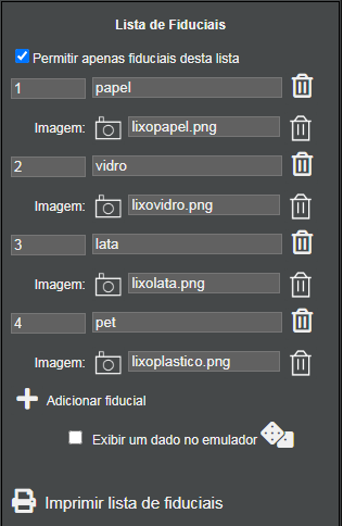
This type of application is used to implement choices based on a random die result. On the tangible tabletop, you can use a die with fiducials corresponding to the numbers 1 to 6 pasted on each of the faces.
The requirements are to create activities respecting the sequence of scenes, such as, for example, a cake recipe where flour, milk, eggs and finally yeast must go respectively.
To do this, requirements must be created in the Requirements List by clicking on Add Requirement and changing the names to meaningful names.
When requirements are needed, the list of fiducials in the fiducial area presents new fields related to it:
- Demands requirements: in this checkbox the necessary requirement must be selected, according to the desired order. If a requirement is selected, you can also define:
- Quantity:
allows to specify the requirement demanded quantity:
- > 0 is the requirement default value, demanding it to be met one or more times.
- > than a specific value which requires it to be met at least a certain number of times, as the requirement also functions as a counter, which is incremented each time it is met.
- < than a specific value which requires it to be met, at most, a certain number of times, as the requirement also functions as a counter, which is incremented each time it is met (completed).
- = to a specific value which requires that it to be met (or not) a certain number of times. This is useful to allow the execution of a menu, for example, by demanding the requirement to be = 0 and entering the menu, it fulfills the requirement (becoming 1). The next time you try to run this menu option, the requirement will not be = 0 and you will not be able to use this option.
- Requirement error image: allows you to choose an image that will be displayed in the area when the demanding requirement has not been met.
- Requirement error audio: allows you to choose an audio that will be played when the demanding requirement has not been met.
- Complete requirement: in this selection box, the requirement that will be fulfilled must be chosen. Each time the requirement is completed, its count (quantity) is increased by one.
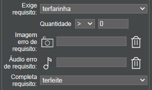
For example, in the case of a cake recipe with flour, milk, eggs and yeast, a Fiducial Area with 4 Fiducial lists with their respective error sounds should be added:
- Fid: 1 (flour) - correct: yes
Demands requirement: none
Completes requirement: tohaveflour - Fid: 2 (milk) - correct: yes
Demands requirement: tohaveflour - Quantity> 0
Completes requirement: tohavemilk - Fid: 3 (eggs) - correct: sim
Demands requirement: tohavemilk - Quantity > 0
Completes requirement: tohaveeggs - Fid: 4 (yeast) - correct: sim
Demands requirement: tohaveeggs - Quantity > 0
Completes requirement: nenhum
Note that the names of the requirements have nothing to do with the names of the fiducials, and may even be the same, but not necessarily.
The list of fiducials is one thing and the list of requirements is another different thing.


Eduba Editor has an emulator that allows you to run and test applications without needing a tangible tabletop, on a computer or tablet.
By clicking on the Show ccene button you can test the applications running by the Emulator. To maintain the aspect ratio of the screen and have a better view, it’s recommended to use full screen view in your browser (press F11 to display the full screen).
Figure 4 shows the emulator screen, with the application's fiducials at the bottom.
.
Figure 4 - Emulator
At the bottom, you will find squares that represent the fiducials. Drag the one that represents a certain fiducial to its respective application area for the interaction to occur. You have to position it over the interaction areas.
You can either drag a fiducial square or simply click on it and then on the desired area. You can change the orientation of a fiducial square by rotating it with a click on the upper right corner.
During execution, the following functionalities can be used according to the pressed key:
- ESC: Exits the application execution and returns to the editor. It’s equivalent to clicking the Close button in the upper right corner of the emulator.
- → (right arrow): for advancing to the next scene
- ← (left arrow): for returning to the previous scene.
- D: Displays the areas contour and information concerning them, along with the list of the correct and incorrect fiducials for the same area. Pressing “D” a second time hides the information.
- A: Displays information concerning whether the areas are OK or not.
- S: Plays the background audio of the scene (the same one that is played as soon as the scene starts). This key is useful for repeating the instruction during the execution of a scene.
- E: Displays the screen as how it will appear on the tangible tabletop, without the emulator elements. Pressing “E” a second time displays the information again.
4 Guide for creating applications
To create an application for a tangible tabletop, you must:
- 1. Define the activity purpose
- 2. Define the number of scenes that an activity needs and the objective of each one
- 3. Choose and edit the images to be used in the scenes;
- 4. Choose and record the audios that will be used in the instructions of each scenes and in the feedbacks
- 5. Using Eduba Editor, create the scenes and configure:
- 5.1. The background image, video or color of the scene
- 5.2. The audio (narration text) for instructing the student while he’s doing the activity, either recording or uploading an MP3 format audio
- 5.3. 3.3. Optionally, you can place a text on the scene, defining its color, size and font.
- 5.4. The images that will compose the scene
- 5.5. The real objects and their respective correct and incorrect fiducials
- 5.6. Delimit the areas of interaction in the scene, according to the fiducials.
- 5.7. The feedback texts and images for each interaction with along with the fiducials, which can be specific for each one (configured in the fiducial of each area) or generic (configured in Feedback section).
- 5.8. 3.8. Add new scenes by clicking on the Add Scene button.
It is possible to animate images in Eduba Editor.
Appearing Animation - Zoom In
The most basic animation is the one in which an image simply appears on the screen.
To do it, just Add Animation Type: Disappear, so that the image does not appear when the scene is displayed. Add Animation Type: Zoom In - Time: 2 seconds.
With that, the image will pop up on the scene with a 2 seconds duration zoom in.
Motion Animation
Another basic animation can be achieved by moving the image from the current position to a new one. To do this, simply Add Animation Type: Movement - Time: 1 second (or the desired time - the longer the time, the slower the animation will be) and drag the image to the desired position. If you need to, you can resize the image.
Animation of entering the scene
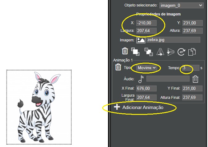
An animation in which the image enters the scene from the left to the center of the screen.
To do this, just add an image and add an animation Type: Motion
- Time: 3 seconds and change the starting position of the image X: -210. Note that the example image is 207 pixels wide, so the starting position X must be either 207 pixels or any other amount to the left of the screen border, so we use the (negative) value of 210. That is, the image will be -210 pixels from the left edge of the screen when the scene is displayed, therefore being outside the visible area of the scene. With the animation, it moves to the final position set in the animation, appearing on the scene.
Animation of appearing on the scene
One interesting animation is the one in which the image appears on the screen by gradually increasing its size, giving the impression that it is coming from far away. To animate an image this way, you will choose, for example, an image of a forest to be the background image and an image of a monkey that will appear on the screen.
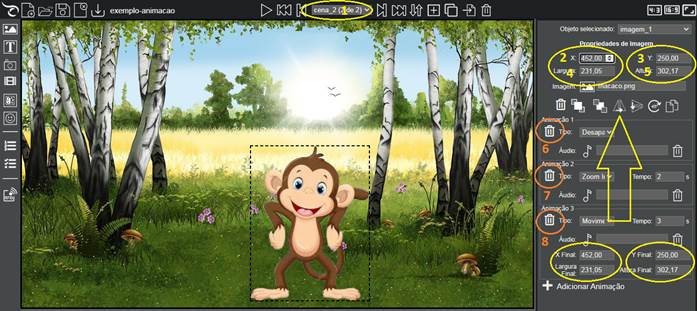
In Eduba Editor, choose the background image (1), click on the Add Image button (2) and then click on the position where the image should be inserted (3).
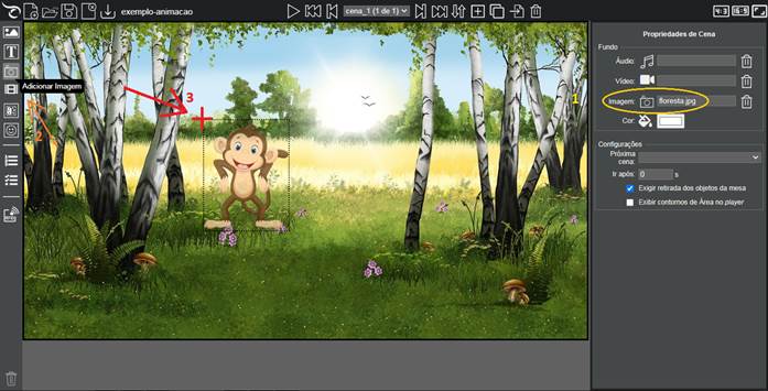
With the monkey image selected, the Image Properties will appear in the right panel.
Click Add Animation (1) and choose Disappear (2), so that the image is not displayed with the scene.
Click again on Add Animation (3) and choose Zoom In, with Time of 2 seconds (4).
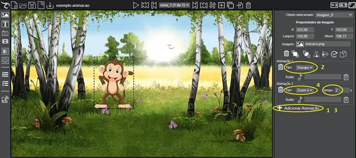
We can also add a motion animation.
Click on Add Animation (1) and choose the Type: Movement (2). Drag the image to the desired position (3) and change its size (4). Choose how long this animation should last: 3 seconds (5).
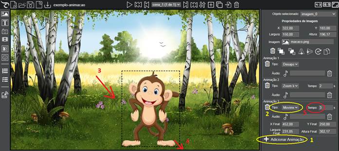
Done! We have a basic animation.
Just test it by clicking on the Show scene button ( 4 ).
If you wanted to, you could have added an audio for each animation, which would be played during the animation. To include an audio, you must click on the audio choice icon for each animation.
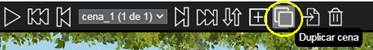
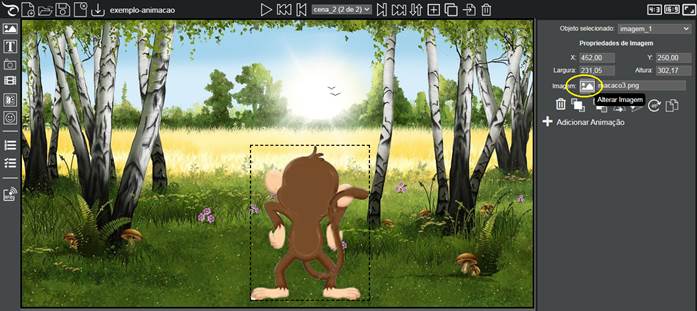
We can continue the animation in the same scene or in a new one. An easy way to make animations by changing images is in a new scene.
Instead of creating it from the start, we are going to duplicate the current scene to take advantage of the background image and image positioning. To duplicate the scene, just click on the Duplicate Scene button.
Be sure you are in scene_2 before proceeding (1), since we are going to continue the animation, the initial image position must be the same as its final position in the previous scene.
Copy the values of Final X, Final Y, Final Width, Final Height, typing in the fields X (2), Y (3), Width (4), Height (5).
Delete all previous animations (6, 7 and 8).
Change the image of the monkey to an image of his back, for example.
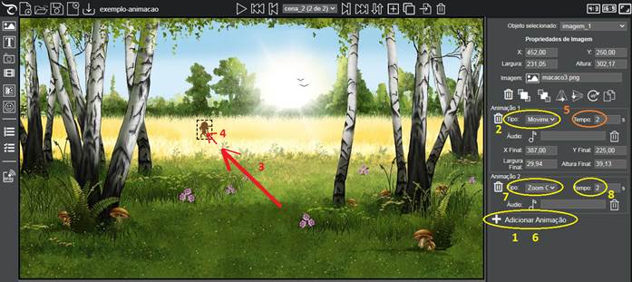
Click on Add Animation (1), choose the Type: Movement (2), drag the image to the final position (3) and change its size (4), so that it is very small, giving the impression of it being far away. Change the Animation Duration Time to 2 seconds (5).
Add one more animation (6) and choose Type: Zoom out (7), so that the image is reduced until it disappears. Set the animation time to last 2 seconds (8).
.
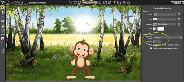
Now, all you need to do is just define the transition from scene_1 to scene_2.
Go back to scene_1 and in the Scene Properties menu, choose the Next scene: cena_2, Go after: 6 seconds .
Techniques with image editing
For the animation, some image editing techniques can be useful.
We used the image of the monkey, with a transparent background saved in a PNG format.
To make the monkey look like it’s turned on its back, we painted its face and belly in brown and painted its ears in pink, along with some details of its tail being over its hands
.


Creating Animated GIFs
Another technique that can be used is to create an animated GIF from the image. To do this, simply mirror the image horizontally and save it under another name.

On the https://gifmaker.me/ website, it is possible to create an animated GIF by uploading 2 or more images.
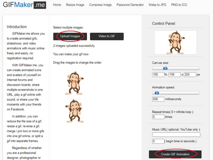
AThus, the monkey will look like it’s moving all the time. In Eduba Editor, an animated GIF can be used instead a PNG static image.